Viridian Central
- Name exploration
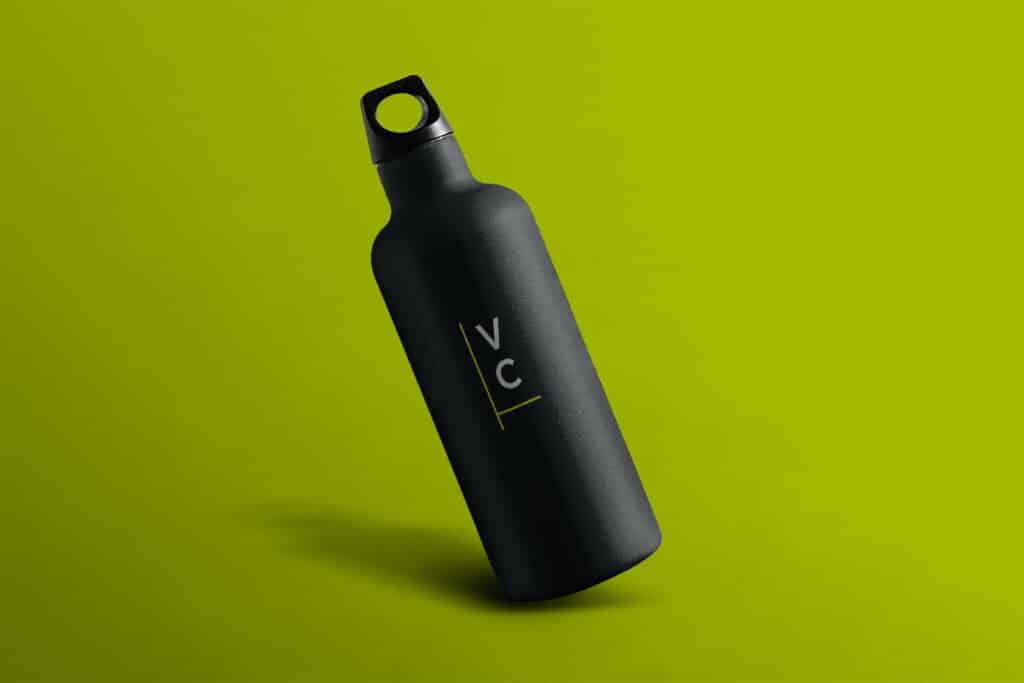
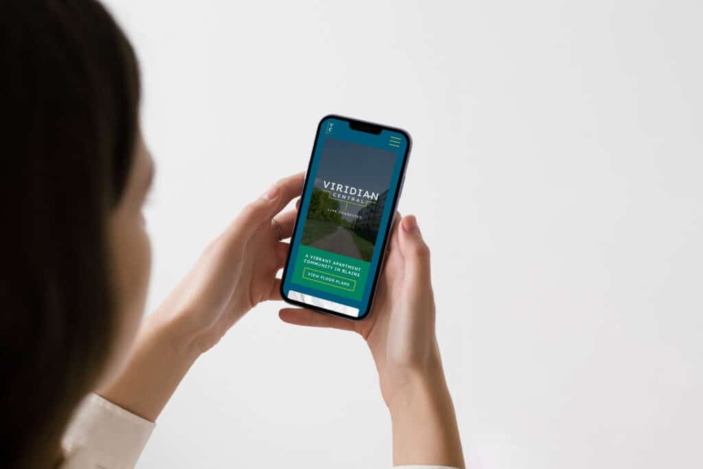
- Brand identity
- Collateral Design
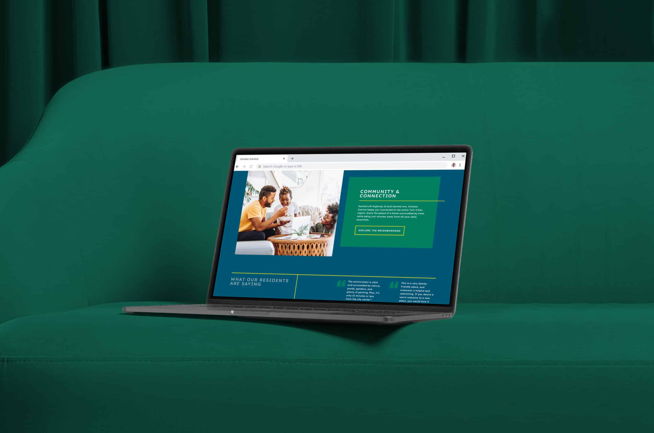
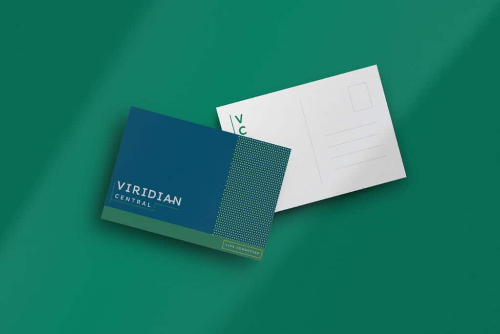
This vibrant community in Blaine, MN needed our help rebranding to restore some life into it post-acquisition. Viridian is a green pigment taking its root from the Latin word “Viridis”, meaning “green”. This provides a more abstract name for the community, showcasing it as a modern and sophisticated building surrounded by nature, while also having direct access to Central Ave – a main vein in Blaine. (We’re poets on the side.)